Logo & Mascot
The visual language of Forwork.
Forwork uses a simple identity system built around clarity, trust, and approachable work signals.
Logo
A clear mark for a clear Work Identity.
The Forwork logo prioritizes readability, recognition, and stable use across profiles, footers, PWA surfaces, OG previews, and work touchpoints.
Favicon
The smallest Forwork mark still needs to be instantly recognizable.
Favicons and app icons appear in browser tabs, shortcuts, PWA surfaces, home screens, and small contexts where the full logo no longer has enough room.

favicon.svg

favicon-light.svg

favicon-dark.svg

apple-touch-icon.png

pwa-192x192.png

maskable-icon-512x512.png
Woan
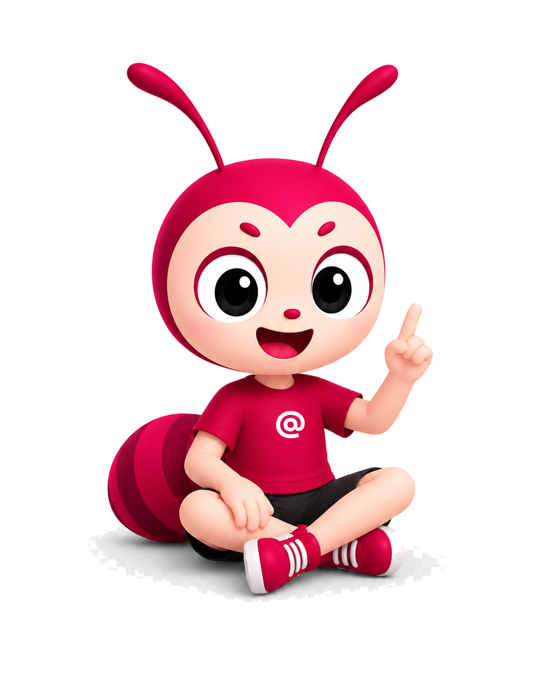
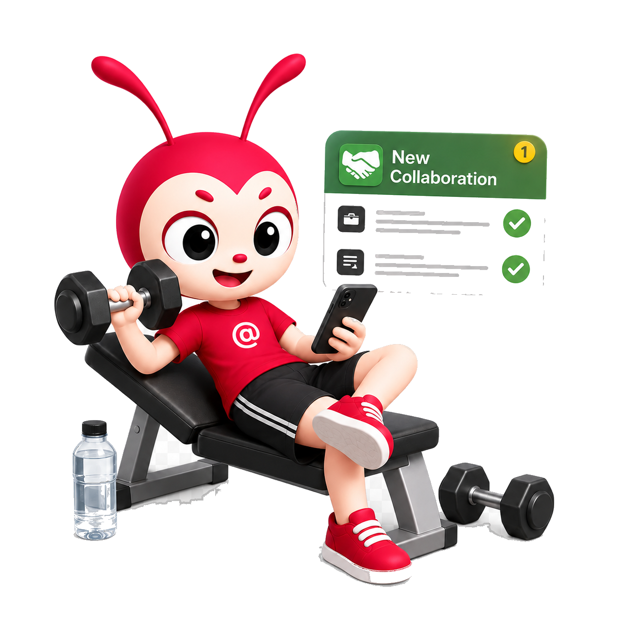
Woan is the guide inside Forwork.
Woan helps Forwork feel less like a cold profile tool and more like a friendly space where people can explain their work clearly.
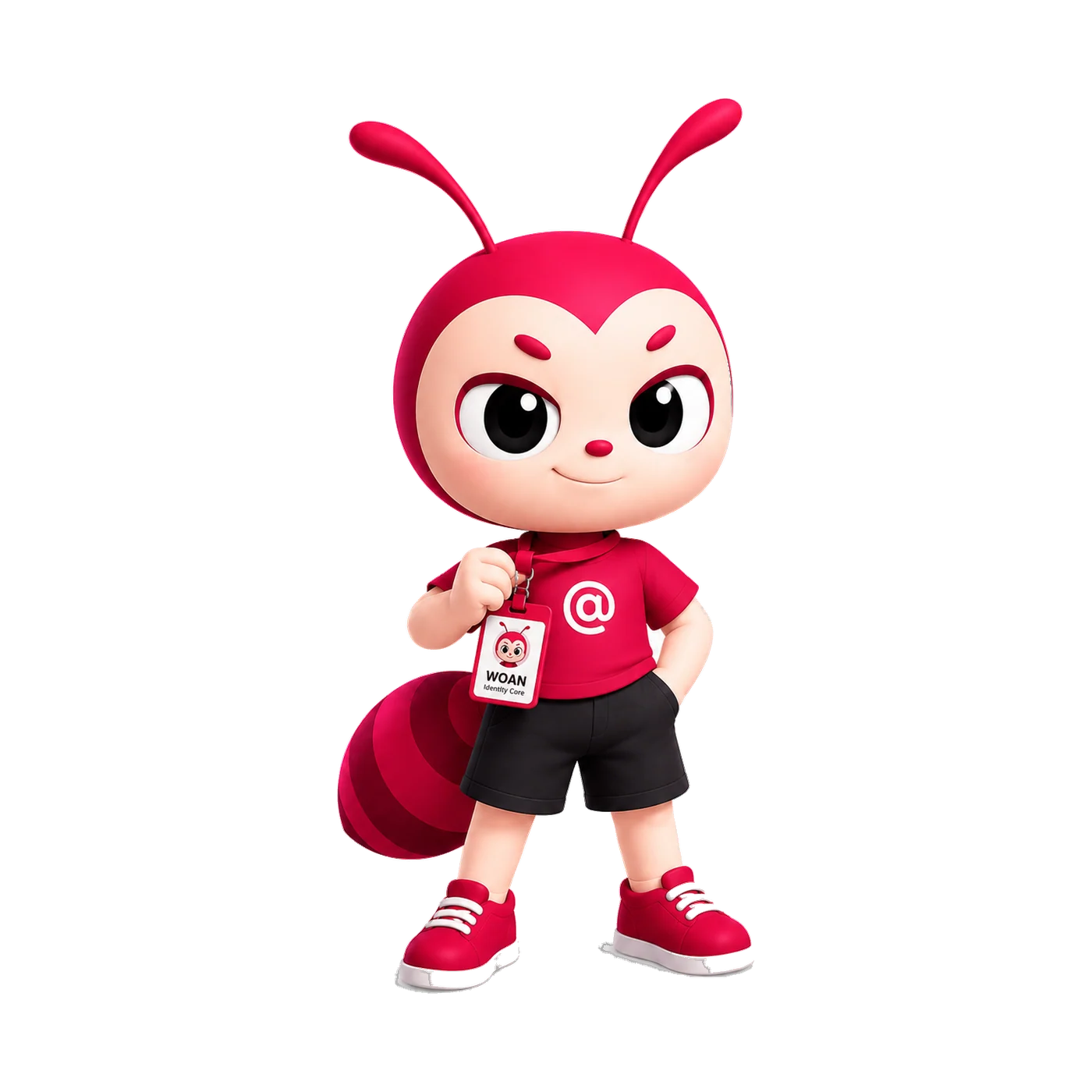
Identity
Helps viewers place who you are quickly.
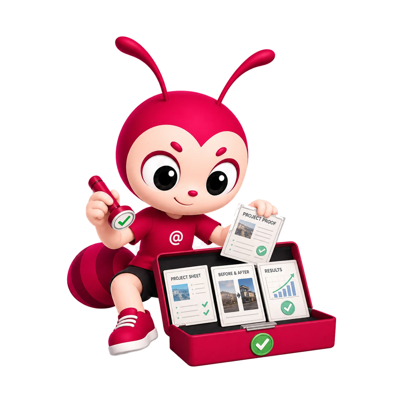
Proof
Guides viewers toward real proof.
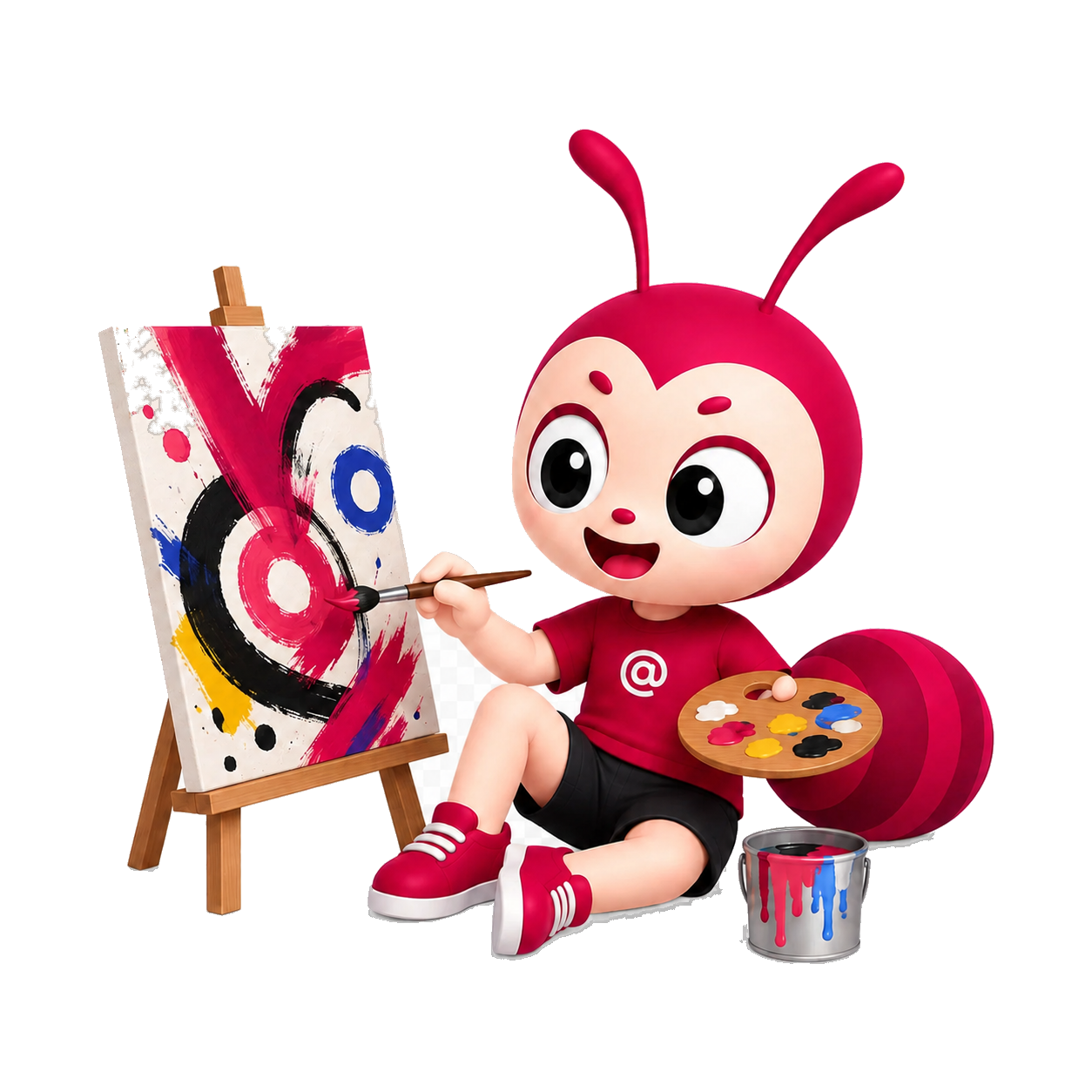
Thinking
Makes practical thinking easier to see.
Contact
Makes the next step feel clearer.
Color
Color is used to guide attention, not decorate every surface.
Forwork Accent
#1800AD · #A99CFF dark
Links, key actions, and identity highlights.Ink
#191919
Strong text, headings, and readable anchors.Paper
#FFFFFF
Clean, calm, focused reading surfaces.Soft Surface
#F1F1EF
Notion-like tags, cards, and quiet hierarchy.Typography
Forwork typography should feel clear, compact, and approachable.
Forwork uses Manrope as the primary typeface across landing pages, UI, and brand copy. If Manrope cannot load, system fonts keep the experience fast and readable.
Aa Bb Cc · 1234567890
Heading
Bold, concise, and slightly tight letter spacing for a confident modern feel.
Body
Readable, comfortable line-height, and focused on clarity over decoration.
Small labels
Use enough weight for metadata, tags, buttons, and navigation.
Naming
Naming should be as consistent as the logo.
Forwork is the official name. 4Work and 4W are shorthand forms for ecosystem context, tight UI, or more casual references.
Use for landing pages, SEO, OG, headings, brand copy, and official touchpoints.
Use when referring to 4Tips, ProfileKit, or products that belong to the same ecosystem.
Works for badges, short labels, tight menus, or internal context. Avoid using it as the main SEO heading.
Use
Forwork for official content.
4Work for ecosystem context.
4W when UI space is very tight.
Avoid
ForWork because the capitalization is wrong.
FourWork because it dilutes recognition.
4work except in URLs or code.
Meaning
Every visual element supports one idea: make work easier to understand.
Clear
Typography, spacing, and layout reduce guesswork.
Human
Woan makes the product friendlier without losing professionalism.
Trustworthy
Consistent marks and restrained colors make profiles feel stable.
Connected
Forwork, 4Tips, and ProfileKit belong to one connected ecosystem.
Usage
Use the identity with enough breathing room.
Do not stretch or recolor the logo randomly.
Use Woan to explain, guide, or introduce a product idea.
Use accent color intentionally and prioritize clarity over decoration.